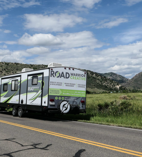
New Name, Same Team
For over a decade, we have offered website design, development, and maintenance, and digital marketing services to a wide variety of organizations. While operating as Road Warrior Creative, a clear pattern emerged: We always put user experience first, whether it was a small landing page for a customer campaign, or a massive web application for the public sector.
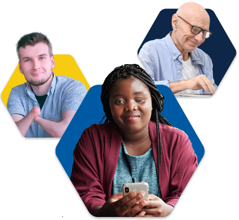
Since our early days, we’ve had the opportunity to experience first-hand the importance of accessible websites. This experience evolved into a passion and a calling. From our desire to make a larger impact within the world of web design and development, Equalize Digital and Accessibility Checker were born.
We are still the same team and we still deliver a lot of the same services to a group of amazing customers, the majority of whom have been with us for years. While we do plan to provide these services to legacy customers for the foreseeable future, we are not accepting new digital marketing customers at this time.
At a Glance
- We have always put user experience first
- Our passion for accessibility is now reflected in our brand and products
- We are maintaining the same team and core values
- We still offer digital marketing services to our existing customers
Our Vision
One day, all people will have equal access to information and tools on the internet, regardless of ability.
New Product & Service Offerings
Equalize Digital provides Automated Accessibility Testing, Accessibility Audits & Remediation, and Bespoke WordPress Websites and Web Applications that happen to be accessible.
Whether you need urgent accessibility help or are planning a new website or application and want to ensure it is accessible to people of all abilities, our unique combination of native automated testing software and expert accessibility consultants make us a leader in WordPress accessibility. Everyone, including our legacy digital marketing customers, is welcome to explore our service and product offerings, and to reach out if you have any questions.